
Intex is a foreign exchange bureau in León, Guanajuato. Previously founded under a different name. With five different local branches, in 2018 a rebrand was proposed.
With great recognition for being one of few foreign exchange houses in the city with a broad currency offer, a rebranding was quite fitting. The brand expression clearly introduces power and progress. We approached a forceful identity with symbols emphasizing on success, growth and confidence, echoing a consistent brand body that along with the passionate color palette empowered a new air to the original brand.
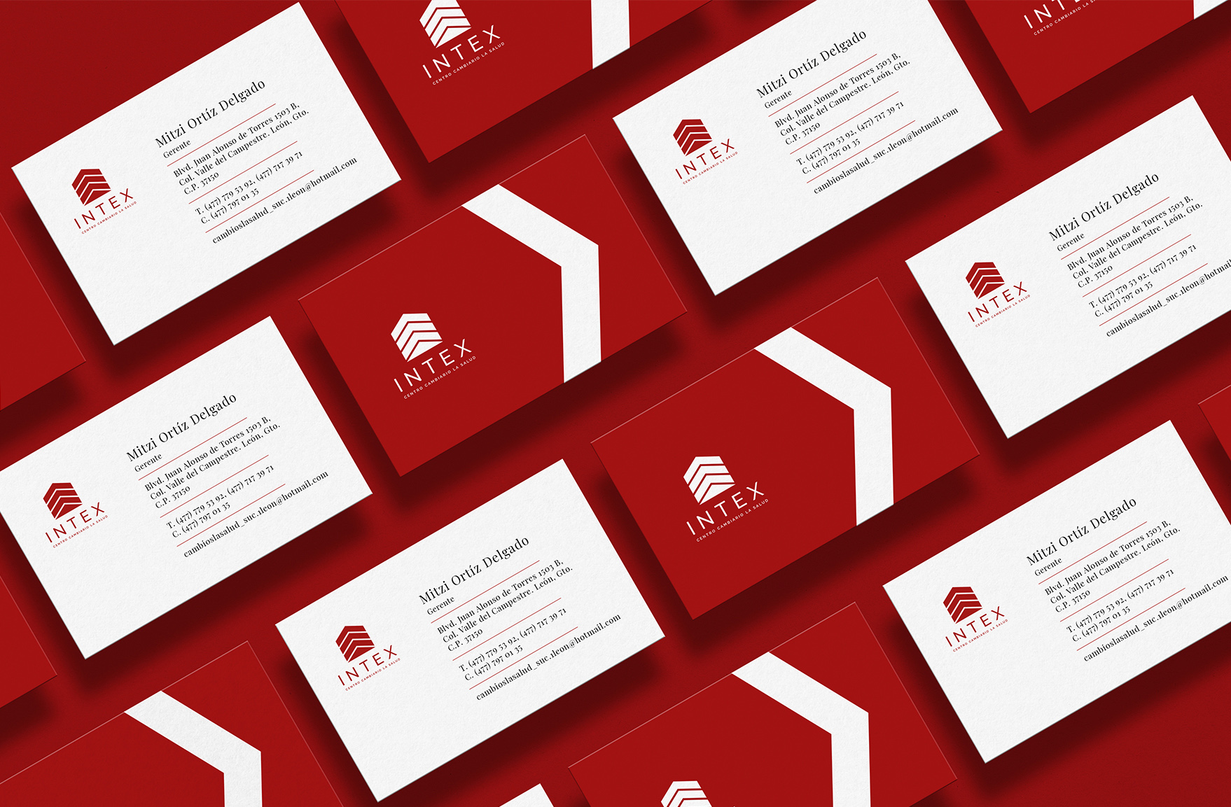
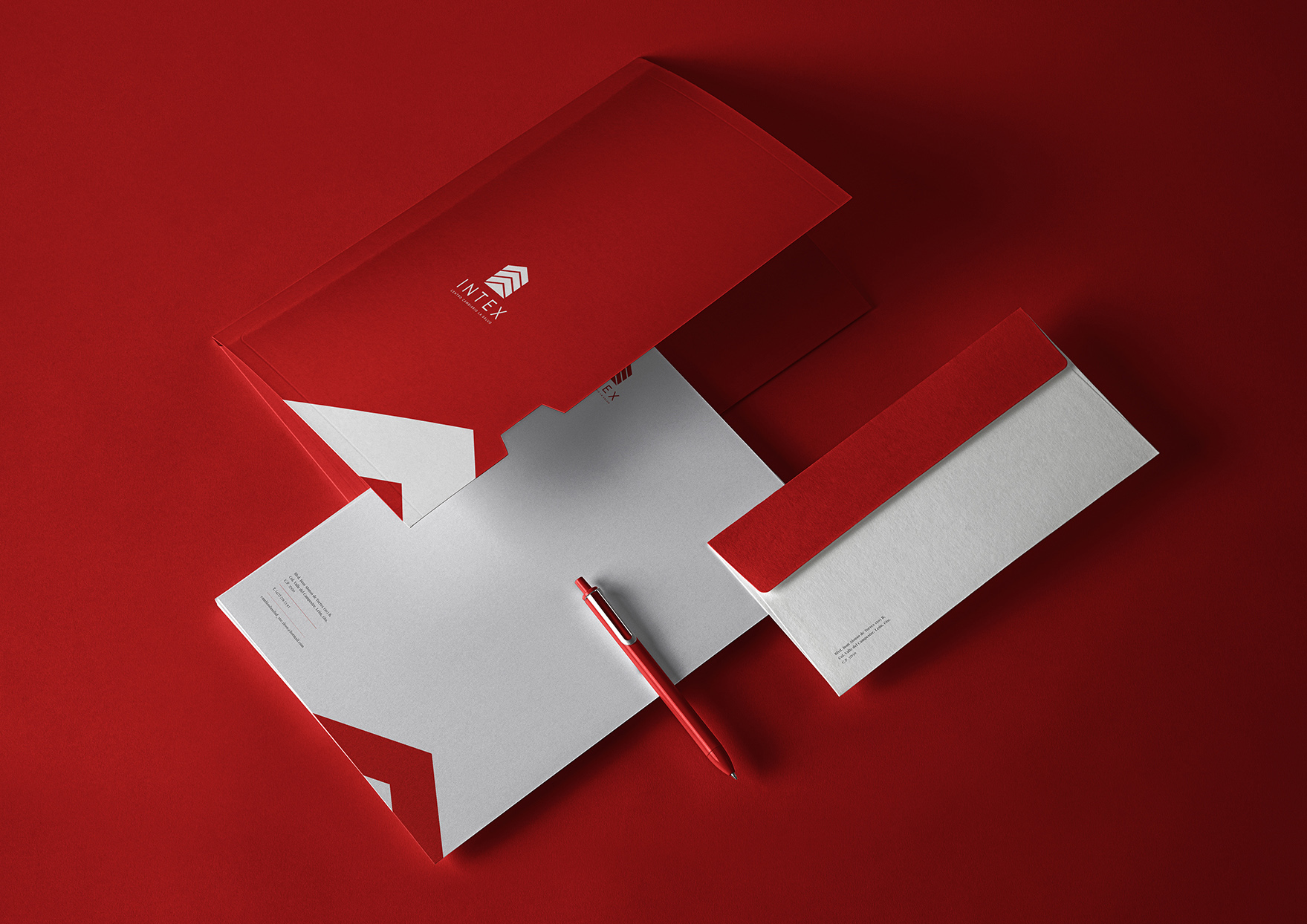
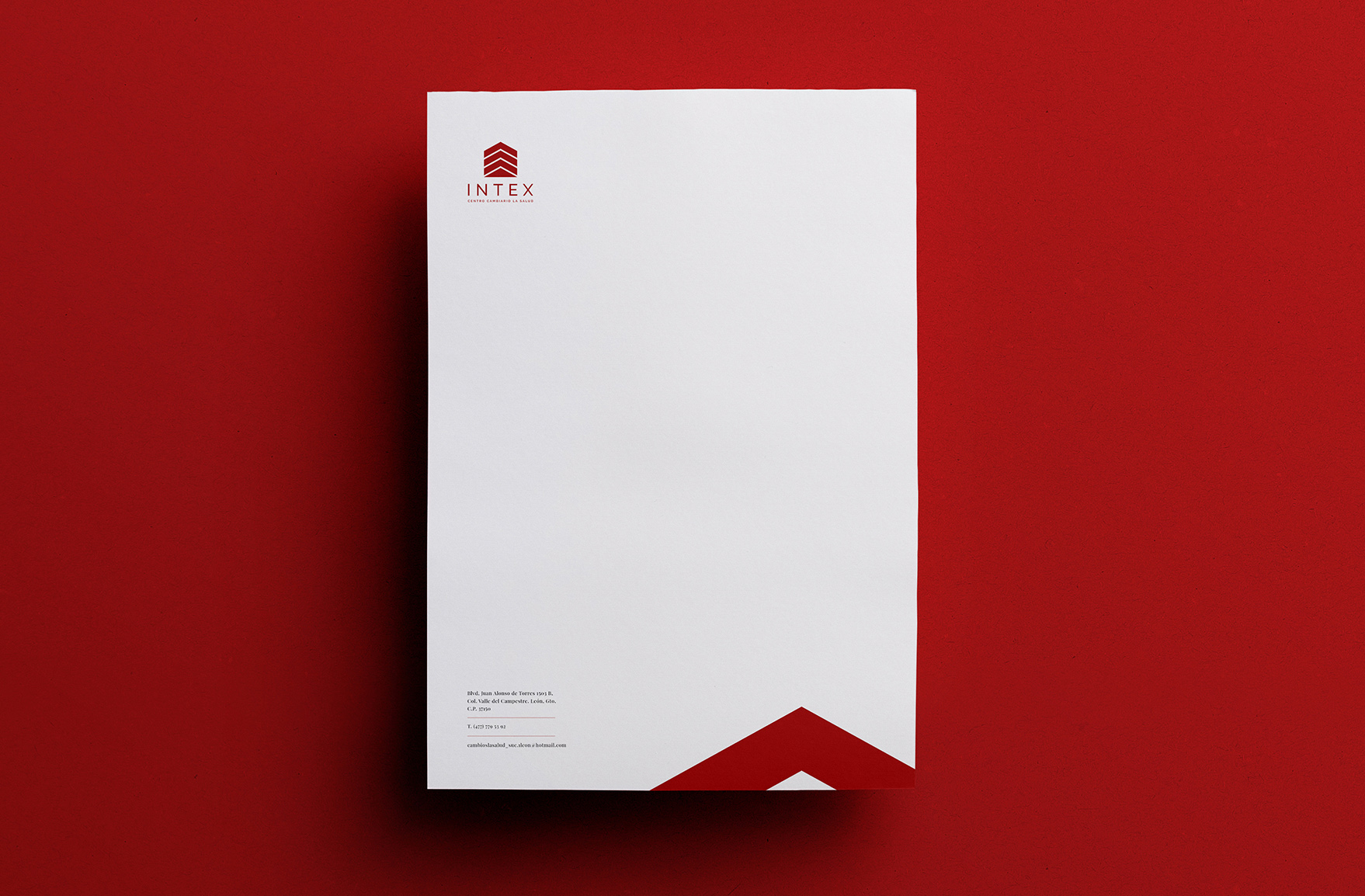
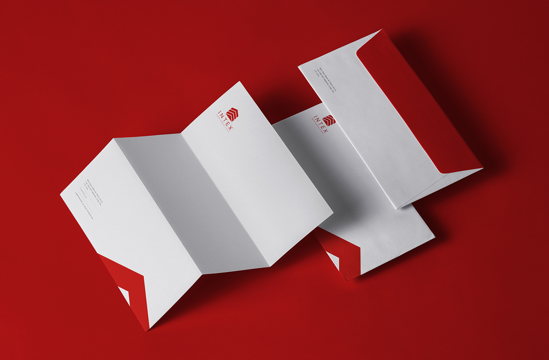
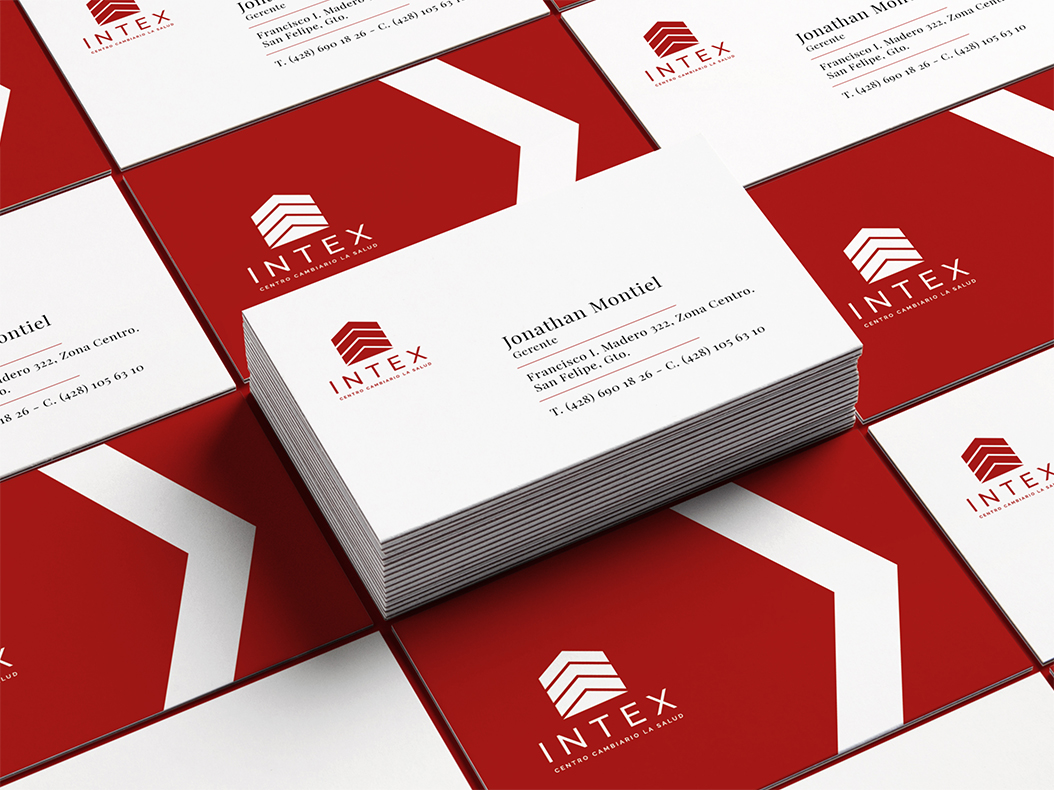
Creative concept, logotype design, stationary.
Red.

"We approached a forceful identity with symbols emphasizing on success, growth and confidence"